
LIVE Results in the Queens District Attorney Democratic Primary
/The Queens Daily Eagle, partnering with Benjamin J. Rosenblatt, will feature live, interactive election results maps as results report in. The data in these maps comes from the New York City Board of Elections and the New York State Board of Elections. A guide on how to understand and use these interactive dashboards is included at the bottom of this page.
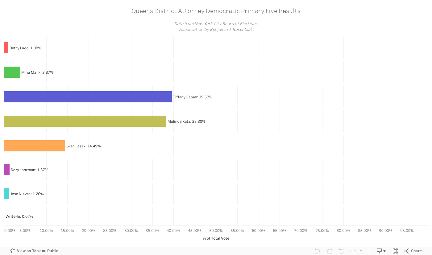
Below is a dashboard featuring live, updating bars for each candidate’s total vote percentage. This first interactive dashboard features individual bars for each candidate, showing their overall performance throughout Queens. The bars will update as results come in.
Below is the interactive results dashboard feature. A how-to guide is included below it.
How to Use the Interactive Dashboards
Selecting Dashboards
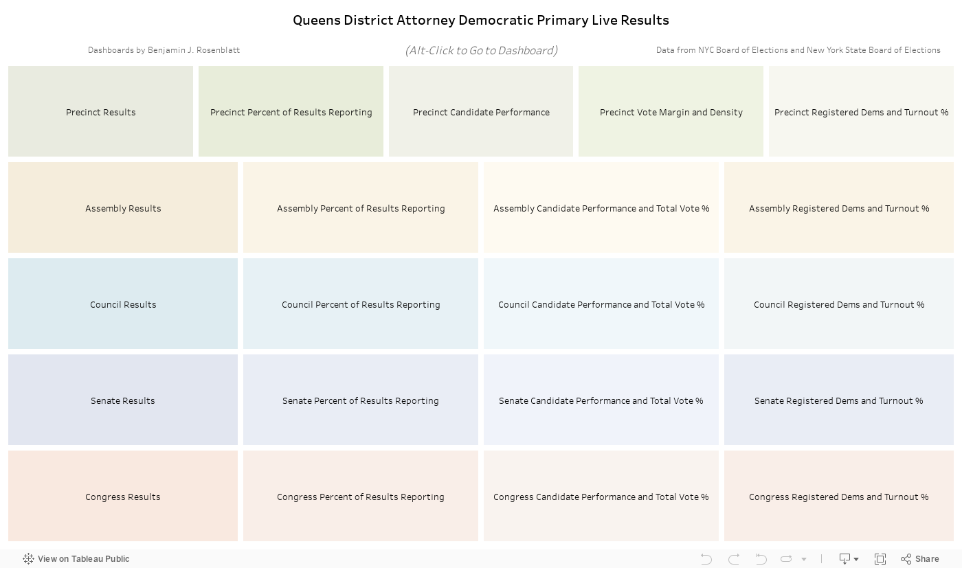
The first feature shown is the Table of Contents. To select any dashboard, simply hold down ALT and click on it (on desktop) or just click on it (on mobile devices). To go back to the Table of Contents, do the same with the “Go to Table of Contents” button featured at the top of every dashboard.
The Different Results Levels
The interactive dashboards featured here provide results at five different levels. The lowest, and most detailed, level is the precinct (also referred to as Election District or ED) level. Above that, there are dashboards featuring results at the state Assembly District, Council District, state Senate district, and Congressional District levels. All dashboards feature interactive legends and a vote breakdown bar and vote chart. The vote breakdown bar and vote chart show the overall percentage for each candidate, and update accordingly when you interact with any dashboard.
Precinct-level dashboards feature a unique feature: the ability to include or exclude precincts in any specific Assembly, Council, Senate, or Congressional district. Simply click on the drop-down for any of these near the top of the dashboard and check or un-check any district. The maps below, as well as the vote breakdown, will update accordingly.
Precinct-level dashboards also feature an Interactive Winner legend at the top of some dashboards. Clicking on a specific winner in this legend will populate the “Result” and “Margin” legends, for that candidate. These legends are further explained below.
Results Dashboard
The first dashboard featured at each level is the results dashboard. This dashboard features two maps, each with its own legend. The map on the left (desktop) or below (mobile) is the Margin map. This map shows the winning candidate in each district, shaded by their percentage margin over the second-place candidate in that district. The map on the right (desktop) or on top (mobile) is the Results map. This map shows the winning candidate in each district but shaded by the winning candidate’s percentage of the vote in that district.
Clicking on any legend feature will update the map to include the corresponding districts. Clicking on it again will revert to the full dashboard.
Percent of Results Reporting Dashboard
The second dashboard featured at each level is the percent of results reporting dashboard. This dashboard features only one map, with colors shaded by the percent of results that have been reporting so far for each district. Areas that are grey or light green have little to no results reported in yet. By the end of the night, the entire map should be dark green.
Candidate Performance and Total Vote Dashboards
The third dashboard featured is the Candidate Performance and Total Vote dashboards. At the precinct level, this dashboard does not include the total vote, but instead features two candidate performance maps: each candidate’s percentage in one map, and each candidate’s votes in the other. In the second map, circles change in size according to the number of votes in each district.
At all other levels, this dashboard features the candidate’s percentage in one map, and the total vote percent in the other. The total vote map shows the percentage of votes in each district out of the total votes borough wide.
Precinct Vote Margin and Density Dashboard
This dashboard is only featured at the precinct level. It features two maps: the vote margin and vote density maps. The vote margin map shows circles in each precinct that change in size according to the raw vote margin between the first and second place candidates, and, like the first dashboard’s margin map, changes color shade by showing the color based on the winning candidate in each precinct and showing the shade based on that candidate’s percent margin over the second place candidate in that district.
The vote density map shows circles in each precinct that change in size according to the raw total number of votes cast in each district. Like the first dashboard’s results map, the circles here change color and shade by showing the color based on the winning candidate in each precinct and showing the shade based on the winning candidate’s percentage of the vote in that district.
Registered Democrats and Turnout Percent Dashboards
The final dashboard, featured at all levels, is the Registered Democrats and Turnout dashboard. At the precinct level the registered Democrats map features the raw number of total registered Democrats by precinct. At all other levels, the map shows the percentage of total registered Democrats in each district out of the total number of registered Democrats borough wide.
The second map featured in this dashboard is the turnout map. At all levels, this map shows the percentage of votes cast in each district out of the total number of registered Democrats in that district; in other words, it shows the turnout percentage in each district.